Sunday 1 May 2016

CHALLENGES I FACED

I faced a few challenges whilst creating my products for the PLATFORM art exhibition:

  • When trying to create my other products and relating them to my poster, I struggled to make them look interesting. I wasn't getting much inspiration and wasn't sure where to place my patterns (pentagons, rectangles etc) on the pages so that they related to the poster but at the same time, looked different and eye-catching. However, after a while, I did gain some inspiration and managed to overcome this challenge. 

  • Also, when I was inserting my rectangle design, I had to make sure that they were the same width apart as well as the same length apart so that they looked even. This took a while because I had to take the measurements of each one and then adjust the rectangle one by one. However, once again, I managed to eventually overcome this challenge and the rectangles were even.

  • Finally, when I was creating my web pages, I wanted to use the same font for the title of the pages that I used for PLATFORM. However, I didn't note down the name of this font (found on dafont.com) and so I had to search through my computer history until I finally found it.

CONTRASTS FROM PLAN

The end results of my art exhibition pieces to slightly differ from my original plan/ideas.

  • I wanted pastel colours on my products that I create for it. However, I got feedback from my fellow students and they said I should use more vibrant colours on my products to make it look more interesting and stand out more so that's what I decided to do. I experimented with lots of different colours and I found five different ones which I didn't think would work together but they did look really good


  • I also changed the font of my text. At first, I wanted a "handwritten" text to be on my pieces of work. I liked the theme of sort of childlike writing and thought it would look really good on my work. However, when I was experimenting I found that it didn't really make the poster looked like an art exhibition one and when I looked at other fonts, I found that bold and block ones looked better!

Thursday 28 April 2016

PERSONAL OPINION

Overall, I'm happy with how my design my art exhibition turned out. 
I am pleased with the colour scheme I used and think it looks really modern which relates to my chosen exhibit.
I also like the fonts that I chose. I didn't want to have a large variety of different fonts on my products because I thought it would look a bit over the top and perhaps not very clear to read. I wanted to have two different font max (as well as the font that is on the TATE MODERN logo) and both fonts I chose were similar but still gave my products that little bit more variety. 

The shapes I used fit really well together and differed in comparison to a lot of other modern art exhibition posters I saw. 


Ways to improve?

  • Next time I could possibly have another background to add a bit more colour and/or make the poster stand out more
  • Took more time to edit the rectangle design I created on my products and perhaps invented a more abstract shape

Monday 25 April 2016

PLATFORM WEBPAGES


Above are my finished web pages. I'm very pleased with how they turned out and think they relate really well to the rest of my products for my art exhibition 'PLATFORM'. My favourite part of my web pages is the splash screen (number 1). I think it's very well presented and has a lot of colour on it and is interesting to look at. Each page contains pentagons of some form to fit with my chosen theme and the font is the same throughout. 

PLATFORM BADGES


These are my final designs for my badges for the art exhibition. I'm really happy with how they turned out as each badge has a different design but at the same time still tie in and relate to the theme of my other products. 

Each badge has the same colour scheme and always includes the name and website for the art exhibition as well as one of the 2 different shapes I used throughout.

My favourite design is either number one or four. 

PLATFORM T SHIRT


This is my final design for my t-shirts for the art exhibition. This design is probably my favourite out of all the designs for PLATFORM.

Again, I used all the same contents for my other products so you can tell it's for the same exhibition. I mixed up the pentagons slightly to make them look more quirky for the t-shirts as I felt like people would be more likely to buy them if they looked more interesting. The front of the t-shirt also includes the type of exhibition, date and location so it can work as an advertisement for the exhibition when people wear it. 

The back of the t-shirt has the TATE MODERN logo right in the centre because I felt like this was quite an important aspect of the exhibition. It also includes, again, the rectangle design similar to the poster, and right at the bottom the website, again, so people can get the information they need.

PLATFORM HEADER


This is my final design for my art exhibition header. I wanted it to include all the same things as my poster did minus the location/date because I felt like this would've been too much to have on a header. However, I wanted to move things around a little so it didn't look exactly the same. I made the pentagons slightly overlap the title of the art exhibition because I thought this looked really interesting but at the same time it still ties in with my poster design.

Again, I have the logo in the bottom corner to let people know where the exhibition is as the header does not state it.

I included the rectangles in the top right-hand corner, however, going in the opposite direction just to change the header up a little bit.

And finally, I included the website to allow people who want to visit the exhibition to know where to look for the information they needed.    

PLATFORM POSTER


Above is my final poster design for my art exhibition 'PLATFORM'. I'm really pleased with how it turned out and think the colours and the overall design and shapes fit really well together. I wanted to have a few different shapes on my poster because when researching I saw that a lot of modern art exhibition posters did include shapes. I went for a slightly different shape which was the pentagon and then chose the standard rectangle shape to also appear on my poster. To relate both shapes together I included the same range of colours for both and put them in the same order. To create the shapes I used the rectangle tool and polygon tool on Photoshop. 


I then changed the opacity of the pentagons. I wanted them to be slightly see through so that the colours weren't so heavy and you could see them overlapping one another. I felt like this made my poster look more interesting and emphasised the shapes. To change the opacity of my shapes I used the opacity tool in Photoshop. 


The font I used for the title, date, location and website of the art exhibition was called Andale Mono Regular. I wanted a different font to my title but I didn't want it to be completely different and I also wanted it to still look modern. I felt that this font fit really well with the initial design and was clear for people looking at the poster to read.


I used the smudge tool on the rectangles at the bottom of the poster to give a bit more effect them. I felt they looked too harsh at the bottom and so I decided to soften just the front of them from left to right using this tool. 


And finally, I inserted the TATE MODERN logo in the bottom left-hand corner of my poster because this is where the art exhibition is being held and so I wanted to include it in my poster.

DESIGN


This was the final design I chose for my art exhibition. This will be the main focus on each of my products I create for the art exhibition. I really liked the way the pentagons fit well together and the overlapping creates a really nice contrasting effect. I also think the colours go really well together and give the final design a bit of variety. 
I found the font on "dafont.com" and instantly chose it for my design! I thought it looked like a very typical art exhibition font. It's very clear, bold and easy to read but also goes really well with my chosen art exhibit and looks really modern. 

Tuesday 19 April 2016

FINAL IDEA: PLATFORM

PLATFORM is the final idea for my exhibition. It is a student art exhibition that takes place at Tate Modern in London in July 2016. 

The art exhibition focuses purely on modern art that has been created by students at local universities. 

I wanted the exhibition to be on modern art because I felt I was able to create a poster, banner, badge, t-shirt and web page design that linked really well to modern art as I wanted to use shapes and modern text and for the design to not be too complex or old fashioned. 

I felt that it was best to make the art exhibition a student one because, as a student myself, I am able to create designs that will attract people my age and/or around my age to make them more intrigued about the art exhibition and therefore, more likely to attend.  


Modern Art Posters Inspiration 


Above are some examples of modern art exhibition posters that I found online. When researching them, I found that a lot of them used lots of different shapes. I thought that shapes made the poster look a lot more modern and therefore related to the chosen art exhibit really well and so I wanted to follow this theme.
However, when I researched these posters, I found that a lot of the shapes were similar (squares, circles, rectangles etc.) and so I decided to use a pentagon shape to make mine stand out and be more unique. I also found that with a pentagon, you could angle it to make it look more funky and quirky which I really liked!

Monday 7 March 2016

WEB DESIGN LAYOUTS INSPIRATION

The only web design that really inspired me was the TATE modern website. 


Because my art exhibition is going to be held at TATE modern gallery, I wanted my web design to relate to this website somehow. I didn't want it to look exactly the same because I wanted a lot more colour on my web design at the TATE website is black and white which is very contrasting and slightly boring.


I know I definitely want to have a 'Shop' page on my web design. I thought this would be a good idea because I want to have different links to different types of art and this would make my web design look more interesting and allow me to do a lot more with it.

T SHIRT INSPIRATION


For my T-Shirt design, I plan to make it very simple but still include the necessities so it is linked to my other designs and follows the theme. On the T-Shirt itself, I want it to include the title of the Design Exhibition, the main logo and maybe some sort of pattern that occurs in the other designs e.g. poster, banner etc. 


I really liked the design of the t-shirt above. This was created by a London based artist called Yoni Alter and is being sold at the Tate Modern shop. I thought the design on this was really clever but at the same time, sort of simple and tells you everything you need to know. I want to achieve something like this with my t-shirts but maybe include a bit more writing for information and advertisment purposes.


I also really liked the design of this t-shirt, also sold in the Tate Modern shop. Again, it's very simple looking but at the same time it's quite complex and has a story behind it. I also like the colours used. Although there's only two, they contrast really well and makes the design on the actual t-shirt really stand out.

BADGES/STICKERS INSPIRATION

didn't find any art exhibition badges that particularly inspired me online. But I know that I want my badges to follow the theme of my other products for my art exhibition and have the title of the exhibition in the centre of the badge so that it stands out.

I also want the badge to include the website on it so that it works as an advertisement and if people see it they can visit the website to find out more about the exhibition (how long it's there for, type of art that will be on show etc.)


Rachael House: Self Portrait with Badges, after Blake

BANNER/HEADER INSPIRATION

I couldn't really find any detailed examples of banners that I particularly liked every aspect of. However, I found some templates that I thought were really nice and that are a particular style that I may want to follow when creating my banner.


I really like the template above. The colours used are very mellow and they go really well together. I also like how simple the design of this banner is. I don't want my banner to be too over the top with the colours or the text because I think a lot of that should be on the poster and the banner should follow on from this. 


The next two banners I found are a lot more complex and 'busy'. Even though I don't really want my banner to be too over the top, I really like the designs below. They're very unique and 'pretty' and although there is a lot going on, it's still nice to look at. The colours and patterns used go really well together on both banners.


POSTER INSPIRATIONS

I have seen so many poster inspirations that I love. Some of them are slightly plain and all of them definitely have something that I would change or add but I can really picture my poster looking something very similar to these designs. The colour schemes are ideal for me and the actual design itself is very "funky" which I really like. 


The poster above is my favourite out of all the ones I've found. I love the colours. They're very pastel and go well together. I also like the patterns used. I like how the patterns haven't been repeated and are only used on certain parts of the poster. The use of the pineapple is very qwerky. The designer has used elements of real life too by using the stalk of the pineapple which I think is really qwerky. 


The poster above also uses pastel colours and they are very similar to the one above. I love how random this poster is, with the little flower in the vase in the bottom left hand corner. I like how the text "Don't let me down" is warped and jumbled yet, you are still able to read it and it's also presented at the very bottom middle of the poster too. I found this poster really obscure and interesting and it inspired me a lot when thinking about the poster I may want to create.


I liked this poster because of the way it was trying to communicate a positive message to the people viewing it by saying "Be kind". I like how the font has been presented and it creates shapes which makes it more interesting to look at. Again, I also love the colours that have been used. They go really well together and highlight the text perfectly. 


This poster was the most obscure one that I've come across. I like how it almost tries to make a face through different shapes, with and eye and some lips to make it more obvious. I really like the shapes used here and how it almost looks hand-drawn. I also really like the font that has been used here. Although it is slightly hard to read, it's different and fits in well with the theme of the poster.

FONT INSPIRATION

When it comes to fonts, I love 'handwritten" font's a lot. I just think they're quite "qwerky" and they look really interesting and bring something unique to posters, banners etc.


I also like script fonts that are joined up. As long as they're clear, I think they look "pretty" and, although they can be quite basic or mainstream, if they're chosen correctly they can really suit the theme of a design and make it look professional. 


COLOUR SCHEME INSPIRATION

I've been thinking about what colour scheme I would like to have throughout all my designs. I researched some and found some pictured below. For my designs, I want quite soft colours. I'm a big fan of pastel colours in general, and I want this to reflect on my work. I don't mind having the occasional bold colour e.g. red or blue in my designs to make it a little less bland, but overall I want the colours to be quite mellow. I want most of the focus to be on the actual writing and picture design rather than the colours. I feel like if the colours are too overpowering, it will cancel out the writing and be too "in your face". 

My favourite colour scheme so far is number 3. I really like the combination of colours that are used and like the fact that there is still one or two bold colours in there. My favourite colour is the 4th one and am planning to possibly use that as my background for all my designs.  

1.

2.

3.

SOFTWARE

The 3 different types of software I will be using to create my designs are InDesign, Photoshop and Illustrator
I will probably try to use all 3 softwares but I will almost certainly be using Photoshop the most as I used this when I studied Media in sixth form and so am familiar with how to use it. 


Monday 29 February 2016

INDESIGN PRACTICE

I had never used InDesign before so I had a go at practicing to recreate two logos that I felt would be quite basic and easy to do as a beginner. 
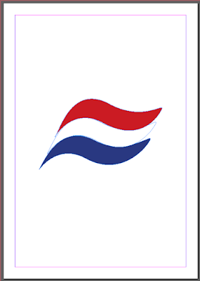
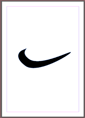
The first logo I recreated was the Nike tick logo and the second logo I created was the Aquafresh toothpaste logo. I used 3 different tools in InDesign to achieve this. 


The first tool I used was the Ellipse Tool. This created a circle on the page that I was then able to play around with to create different shapes.


After the Ellipse tool, I went on to use the Direct Selection Tool. This tool allowed me to pull different parts of my already made circle around to almost 'warp' it and create different shapes. This was how I achieved the shape of the Nike tick and the wave effect of the Aquafresh logo. 


 And finally, I used the Fill tool to fill in the whole logo to match the colour of them. 


INSPIRATION

My design tastes differ a great deal. I find lots of different graphic designs interesting and intriguing. On one hand, I like simple and "pretty" looking designs like the ones below. They're quite simple and there isn't much going on in them but I like the way they look and I think that sometimes, less is more.


I really like how basic this design is. It's very cleverly done and does what it needs to do. I like how an object is created out of text, in this case an umbrella, and we are actually able to tell what it is. The designer could've easily had a picture of a normal umbrella and placed the font somewhere else on the page separately. Instead, they chose to combine it and I think that's very creative and hopefully something similar to what I am able to achieve. 


This design has been created by the same designer. Again, the design is fairly basic but is very nice and easy on the eye. There isn't much going on in the photo but again, less is more. I like how the flowers are placed in the centre of the text with a faded effect. I also really like the colours that has been used as they're quite cool toned. I like the way the font has been presented as well. It's still easy to read but the letters are quite funky and obscure.

As well as basic designs, I also like designs that have a lot going on, but aren't too over the top. 


This design really stood out for me. I love the colours and the gradient that is created by them. I really like how the insect is created through circles and is clearly the main attraction of the design as it takes up the whole page. Personally however, I would change the design and make the insect slightly smaller so I am able to insert some text above or below it.  


The final design that stood out a lot for me is the one above. I don't think I'm necessarily going to be creating one like this but I thought it was really cute. I love how the letters are quite simply placed but the designer has added an animal that begins with each letter on or around it. I also love the colour scheme that has been used and they all go really well together.