Monday, 25 April 2016
PLATFORM BADGES
These are my final designs for my badges for the art exhibition. I'm really happy with how they turned out as each badge has a different design but at the same time still tie in and relate to the theme of my other products.
Each badge has the same colour scheme and always includes the name and website for the art exhibition as well as one of the 2 different shapes I used throughout.
My favourite design is either number one or four.
PLATFORM T SHIRT
This is my final design for my t-shirts for the art exhibition. This design is probably my favourite out of all the designs for PLATFORM.
Again, I used all the same contents for my other products so you can tell it's for the same exhibition. I mixed up the pentagons slightly to make them look more quirky for the t-shirts as I felt like people would be more likely to buy them if they looked more interesting. The front of the t-shirt also includes the type of exhibition, date and location so it can work as an advertisement for the exhibition when people wear it.
The back of the t-shirt has the TATE MODERN logo right in the centre because I felt like this was quite an important aspect of the exhibition. It also includes, again, the rectangle design similar to the poster, and right at the bottom the website, again, so people can get the information they need.
PLATFORM HEADER
Again, I have the logo in the bottom corner to let people know where the exhibition is as the header does not state it.
I included the rectangles in the top right-hand corner, however, going in the opposite direction just to change the header up a little bit.
And finally, I included the website to allow people who want to visit the exhibition to know where to look for the information they needed.
PLATFORM POSTER
Above is my final poster design for my art exhibition 'PLATFORM'. I'm really pleased with how it turned out and think the colours and the overall design and shapes fit really well together. I wanted to have a few different shapes on my poster because when researching I saw that a lot of modern art exhibition posters did include shapes. I went for a slightly different shape which was the pentagon and then chose the standard rectangle shape to also appear on my poster. To relate both shapes together I included the same range of colours for both and put them in the same order. To create the shapes I used the rectangle tool and polygon tool on Photoshop.
I then changed the opacity of the pentagons. I wanted them to be slightly see through so that the colours weren't so heavy and you could see them overlapping one another. I felt like this made my poster look more interesting and emphasised the shapes. To change the opacity of my shapes I used the opacity tool in Photoshop.
The font I used for the title, date, location and website of the art exhibition was called Andale Mono Regular. I wanted a different font to my title but I didn't want it to be completely different and I also wanted it to still look modern. I felt that this font fit really well with the initial design and was clear for people looking at the poster to read.
I used the smudge tool on the rectangles at the bottom of the poster to give a bit more effect them. I felt they looked too harsh at the bottom and so I decided to soften just the front of them from left to right using this tool.
And finally, I inserted the TATE MODERN logo in the bottom left-hand corner of my poster because this is where the art exhibition is being held and so I wanted to include it in my poster.
DESIGN
This was the final design I chose for my art exhibition. This will be the main focus on each of my products I create for the art exhibition. I really liked the way the pentagons fit well together and the overlapping creates a really nice contrasting effect. I also think the colours go really well together and give the final design a bit of variety.
I found the font on "dafont.com" and instantly chose it for my design! I thought it looked like a very typical art exhibition font. It's very clear, bold and easy to read but also goes really well with my chosen art exhibit and looks really modern.
Tuesday, 19 April 2016
FINAL IDEA: PLATFORM
PLATFORM is the final idea for my exhibition. It is a student art exhibition that takes place at Tate Modern in London in July 2016.
The art exhibition focuses purely on modern art that has been created by students at local universities.
I wanted the exhibition to be on modern art because I felt I was able to create a poster, banner, badge, t-shirt and web page design that linked really well to modern art as I wanted to use shapes and modern text and for the design to not be too complex or old fashioned.
I felt that it was best to make the art exhibition a student one because, as a student myself, I am able to create designs that will attract people my age and/or around my age to make them more intrigued about the art exhibition and therefore, more likely to attend.
Modern Art Posters Inspiration


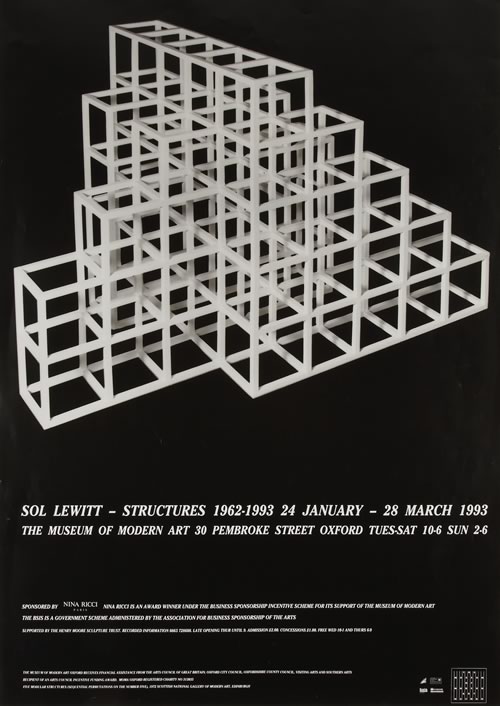
Above are some examples of modern art exhibition posters that I found online. When researching them, I found that a lot of them used lots of different shapes. I thought that shapes made the poster look a lot more modern and therefore related to the chosen art exhibit really well and so I wanted to follow this theme.
However, when I researched these posters, I found that a lot of the shapes were similar (squares, circles, rectangles etc.) and so I decided to use a pentagon shape to make mine stand out and be more unique. I also found that with a pentagon, you could angle it to make it look more funky and quirky which I really liked!
The art exhibition focuses purely on modern art that has been created by students at local universities.
I wanted the exhibition to be on modern art because I felt I was able to create a poster, banner, badge, t-shirt and web page design that linked really well to modern art as I wanted to use shapes and modern text and for the design to not be too complex or old fashioned.
I felt that it was best to make the art exhibition a student one because, as a student myself, I am able to create designs that will attract people my age and/or around my age to make them more intrigued about the art exhibition and therefore, more likely to attend.
Modern Art Posters Inspiration


Above are some examples of modern art exhibition posters that I found online. When researching them, I found that a lot of them used lots of different shapes. I thought that shapes made the poster look a lot more modern and therefore related to the chosen art exhibit really well and so I wanted to follow this theme.
However, when I researched these posters, I found that a lot of the shapes were similar (squares, circles, rectangles etc.) and so I decided to use a pentagon shape to make mine stand out and be more unique. I also found that with a pentagon, you could angle it to make it look more funky and quirky which I really liked!
Monday, 7 March 2016
WEB DESIGN LAYOUTS INSPIRATION
The only web design that really inspired me was the TATE modern website.
Because my art exhibition is going to be held at TATE modern gallery, I wanted my web design to relate to this website somehow. I didn't want it to look exactly the same because I wanted a lot more colour on my web design at the TATE website is black and white which is very contrasting and slightly boring.
I know I definitely want to have a 'Shop' page on my web design. I thought this would be a good idea because I want to have different links to different types of art and this would make my web design look more interesting and allow me to do a lot more with it.
Subscribe to:
Posts (Atom)